In this article, you’ll learn how to add/change the color of points, text and lines. We will also be creating a plot and will try various aesthetic manipulations in the same plot, like changing the text color, line color and point color.
In general, we use these arguments inside the plot() function itself.
We can define the color in the plot() function using col. In the example below, we will see how to add the colors to a line plot. We can change the type of the plot, but the color syntax will be exactly the same, just add a col to the main plot() function.
Usage
> plot(x, y, main="My plot", col="blue", col.main="red", col.lab="green")Arguments
x | the coordinates of points in the plot. Alternatively, a single plotting structure, function or any R object with a plot method can be provided. |
y | the y coordinates of points in the plot, optional if x is an appropriate structure. |
main | an overall title for the plot. The default is "XY plot". |
col | color for the plotting “character”. The default is "black". |
col.main | Sets or changes the color for the title. |
col.lab | This attribute sets or changes the color for x and y labels. |
Adding color to marker
We can add colors to a marker in a plot using the col argument inside the plot() function. We can simply assign the col argument a color.
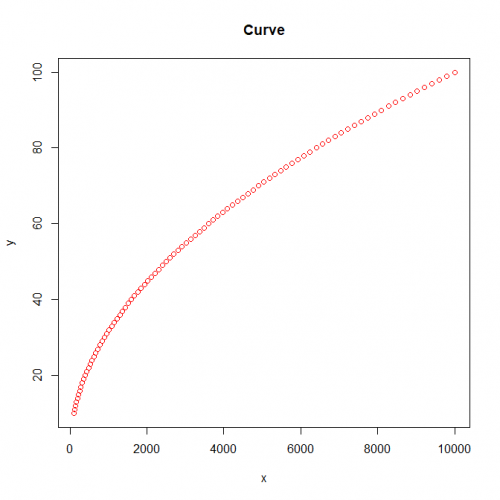
Here is the plot with a red marker color.
> y <- c(10:100)
> x <- y*y
> plot(x, y, main="Curve", col="red") 
Adding color to title
Similarly, we can add a color for the title of our plot with the col.main argument in the plot() function. We can simply assign the col.main argument a color.
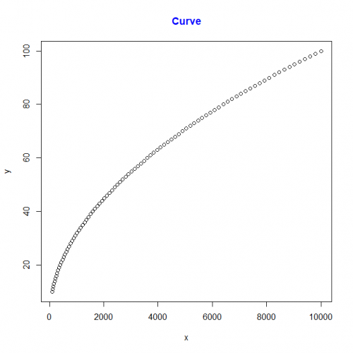
Here is the plot with a blue title color.
> plot(x,y,main="Curve",col.main="blue")
Adding color to x and y label
Similarly, we can add a color for the x and y label of our plot with the col.lab argument in the plot() function. We can simply assign the col.lab argument a color.
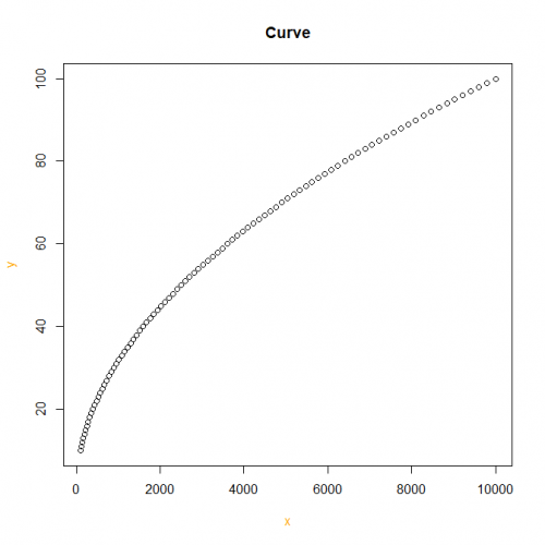
Here is the plot with orange x and y label.
> plot(x,y,main="Curve",col.lab="orange")
Conclusion
In this article we saw, how colors can be added to the plots and how we can add colors for the x and y axes as well.
This brings the end of this Blog. We really appreciate your time.
Hope you liked it.
Do visit our page www.zigya.com/blog for more informative blogs on Data Science
Keep Reading! Cheers!
Zigya Academy
BEING RELEVANT
