 Multiple Choice Questions
A line graph
makes comparisons
show trend over time
compares structures
compares structures
Given is a line graph showing the number of accidents in a city during the first 6 months of 1999.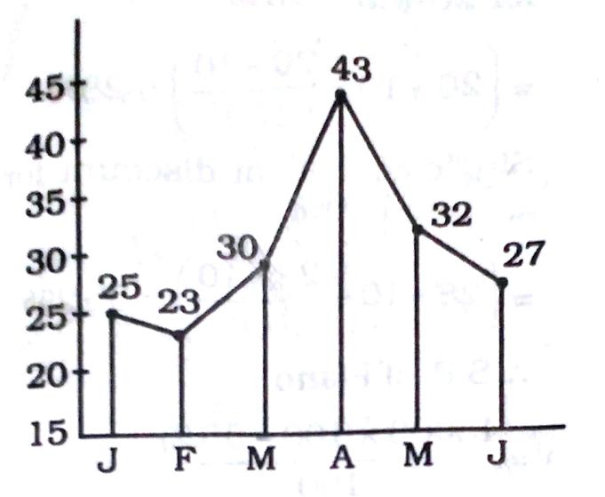
The decrease % of accidents from May to June is


The following line diagram represents the yearly sales figures of a company in the years 2001-2010. Examine the diagram and answer the questions 81 to 85.
By what percent did the sales in 2008 decrease in comparison to the sales in 2006?
20
18

The following line diagram represents the yearly sales figures of a company in the years 2001-2010. Examine the diagram and answer the questions 81 to 85.
The ratio of sales in 2002 to that in 2007 is
2 : 3
1 : 3
1 : 1
1 : 1
The following line diagram represents the yearly sales figures of a company in the years 2001-2010. Examine the diagram and answer the questions 81 to 85.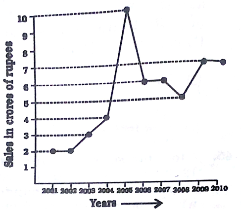
Average sales (in crores of ₹) of the company during the period 2003 - 2007 is
5.8
5
6
6
The following line diagram represents the yearly sales figures of a company in the years 2001-2010. Examine the diagram and answer the questions 81 to 85.
The percentage increase in sales in the year 2005 with respect to the previous year is
80
100
120
120
The following line diagram represents the yearly sales figures of a company in the years 2001-2010. Examine the diagram and answer the questions 81 to 85.
Total sales (in crores of ₹) from 2005 to 2008 is
17
27
22
22
The following graph shows production (in thousands) of two types (P and Q) of vehicles by a factory over the years 2009 to 2014. Study the graph and answer the given questions.
In how many of the given years, was the production of Type P vehicles of the company more than the average production of this type vehicles in the given years?
3
4
2
2
The following graph shows production (in thousands) of two types (P and Q) of vehicles by a factory over the years 2009 to 2014. Study the graph and answer the given questions.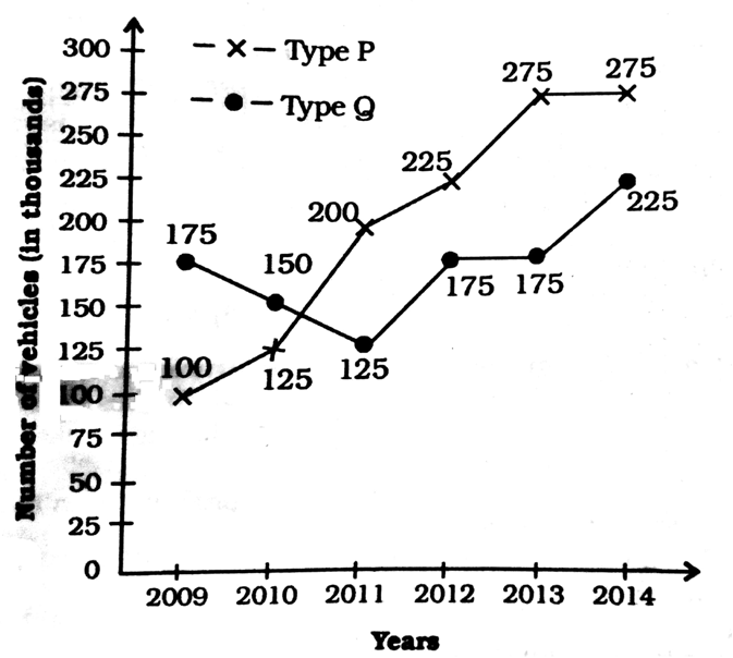
Approximate percentage decrease in production of Type Q vehicles from 2010 to 2011 is
10.1
16.7
14.3
14.3
The following graph shows production (in thousands) of two types (P and Q) of vehicles by a factory over the years 2009 to 2014. Study the graph and answer the given questions.
The total production of Type P vehicles in the years 2009 and 2011 is what percent of total production of Type Q vehicles in 2010 and 2014?
75
69.25
80
80


