A Bar Graph (or a Bar Chart) is a graphical display of data using bars of different heights.
They are good if you want to visualize the data of different categories that are being compared with each other.
In R, you can create a bar graph using the barplot() function. It has many options and arguments to control many things, such as labels, titles and colors.
Usage
> barplot(x, y, type, main, xlab, ylab, pch,
          col, las, bty, bg, cex, …)
Arguments
| Value | Description |
height | A vector or matrix of values describing the bars which make up the plot |
width | A vector specifying bar widths |
space | The amount of space left before each bar |
names.arg | The names to be plotted below each bar |
legend.text | The text used to construct a legend for the plot |
beside | If TRUE the columns are portrayed as juxtaposed bars |
horiz | If TRUE, the bars are drawn horizontally |
density | The density of shading lines |
angle | The slope of the shading line |
main | An overall title for the plot |
xlab | The label for the x-axis |
ylab | The label for the y axis |
Create a Bar Graph
To get started, We need to a dataset to create a bar pot. For this example we are going to make a dataset Fruits
> fruits <- c(Banana=10, orange=80, Kiwi=30, Grapes=20, Apple=50)
> fruits
Banana orange   Kiwi Grapes  Apple
    10     80     30     20     50
To create a bar graph just specify the vector in barplot() function.
> barplot(fruits)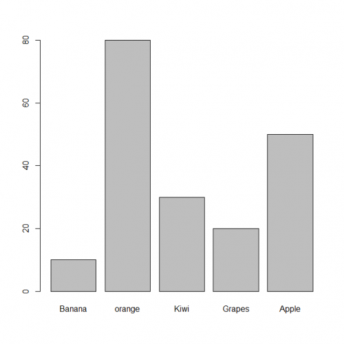
Coloring a Bar Graph
Use col argument to change the colors used for the bars.
> barplot(fruits,
          col= c("red", "green", "blue", "yellow", "orage", "purple"))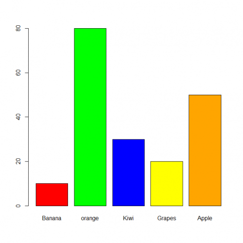
Create a Hatched Bar Graph
Creating hatched graphs in R is rather easy, just specify the density argument in the barplot() function.
By default, the bars are hatched with 45° slanting lines; however, you can change it with the angle argument.
> barplot(fruits,
          col= "red",
          density = 20,
          angle = 45)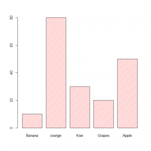
Bar Width and Spacing
To make the bars narrower or wider, set the width of each bar with the width argument. Larger values make the bars wider, and smaller values make the bars narrower.
> barplot(fruits,
          col= "red",
          density = 20,
          angle = 45,
          space = 1,
          width = c(10, 35, 25, 20, 30))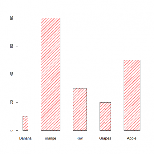
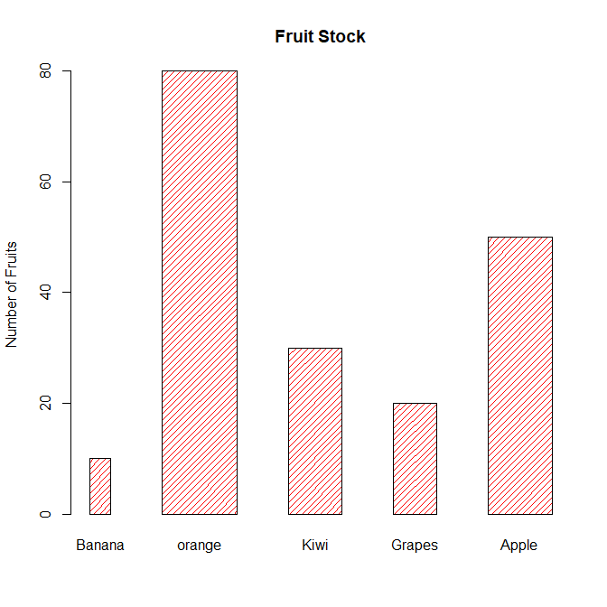
Adding Titles and Axis Labels
You can add your own title and axis labels easily by specifying following functions.
> barplot(fruits,
          col= "red",
          density = 20,
          angle = 45,
          space = 1,
          width = c(10, 35, 25, 20, 30),
          main = "Fruit Stock",
          ylab = "Number of Fruits")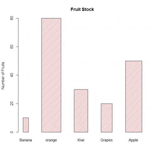
Horizontal Bar Graph
You can also plot bars horizontally by setting the horiz argument to TRUE.
> barplot(fruits,
          col= "red",
          density = 20,
          angle = 45,
          space = 1,
          width = c(10, 35, 25, 20, 30),
          main = "Fruit Stock",
          xlab = "Number of Fruits",
          horiz = TRUE)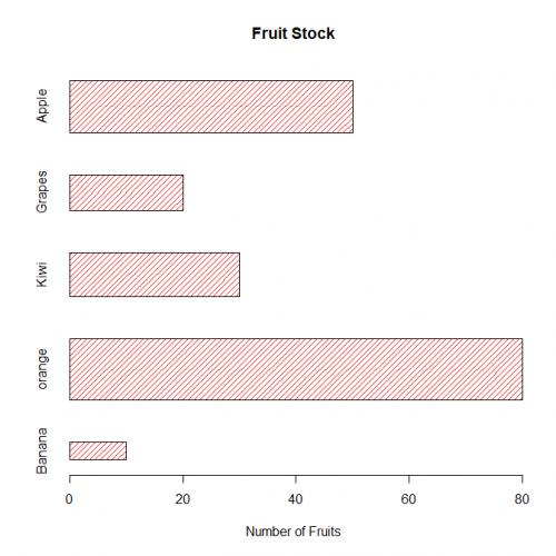
Stacked Bar Graph
If your data contains several groups of categories, you can display the data in a bar graph in one of two ways. You can decide to show the bars in groups (grouped bars) or you can choose to have them stacked (stacked bars).
Let’s put the data in a matrix
> new <- c(Banana=10, orange=80, Kiwi=30, Grapes=20, Apple=50)
> old <- c(Banana=4, orange=35, Kiwi=15, Grapes=40, Apple=50)
> fruits <- rbind(old, new)
Now you can pass this matrix to the barplot() function to create a stacked bar graph.
> barplot(fruits,
          col= c("green", "yellow"),
          main = "Fruit Stock",
          legend.text = rownames(fruits),
          args.legend=list(cex=0.75,x = "topright"),
          ylab = "Number of Fruits")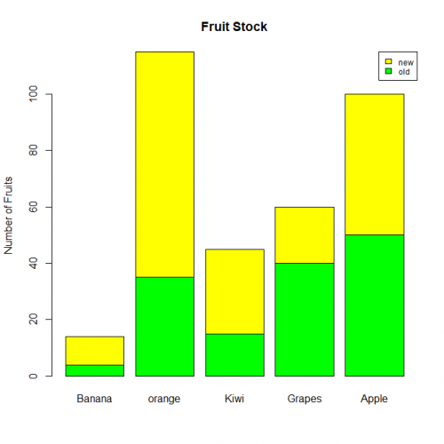
Conclusion
Hence we studied, How to make Bar plot in R, with different colors and different widths along with different density and also learned how to make a stacked bar plot.
This brings the end of this Blog. We really appreciate your time.
Hope you liked it.
Do visit our page www.zigya.com/blog for more informative blogs on Data Science
Keep Reading! Cheers!
Zigya Academy
BEING RELEVANT