Creating and generating plots can be done using a new package in R called “plotly”. With plotly we can create many interactive plots. In this article, we’ll learn how to create interactive data visualization with the help of this library.
What is Plotly?
Plotly is an open-source data visualization library for Python and R written in JavaScript, making graphs inherently interactive. They can be modified tremendously and are easily exported as images, HTML, etc. for seamless integration into a number of applications.
Installing and loading package
> install.packages("plotly")
> library(plotly)
Scatter Plot
- Basic Scatter Plot
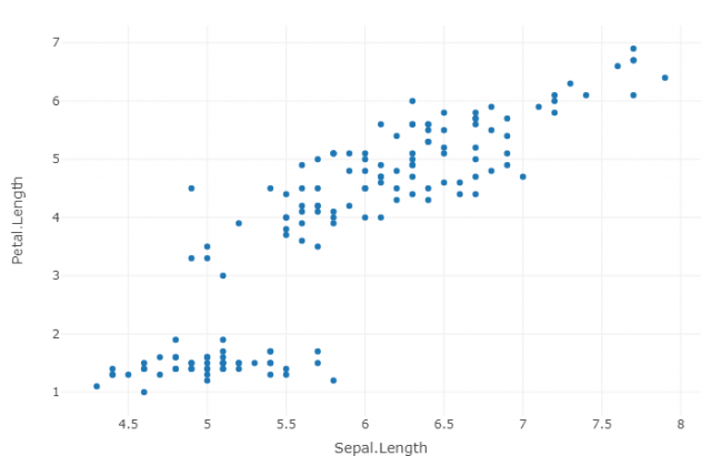
Before to write your graph’s code in RStudio, please make sure to install Plotly package.Iris data setis used to create basic scatter plot.
You can download the IRIS data set here and import in your RStudio project:
During the tutorial, all arguments of functions will be explained clearly.
# Before writing codes, please import IRIS.csv dataset.
> library(plotly)
> fig <- plot_ly(data = iris, x = ~Sepal.Length, y = ~Petal.Length)
> fig
plot_ly(data= your imported data set, x= ~x axis of graph, y= ~y axis of graph
Fig <- is what you are trying to plot, it takes in the data and layout parameter which we had already defined.
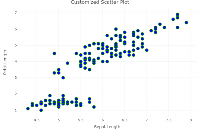
2. Customized Scatter Plot
> fig <- plot_ly(data = iris, x = ~Sepal.Length, y = ~Petal.Length,
+               marker = list(size = 10,
+                             color = 'blue',
+                             line = list(color = 'green',
+                                         width = 2)))
> fig <- fig %>% layout(title = 'Customized Scatter Plot',
+         yaxis = list(zeroline = FALSE),
+         xaxis = list(zeroline = FALSE))
> fig
marker= used to customize the style of filling, list( size= size of dots, color= ‘filling color of dots’, line=list(color= ‘color of dot borders’, width = size of dot borders
layout= modify the layout of a plotly visualization (title= main title of chart, yaxis= list(zeroline= Determines whether or not a line is drawn along the 0 value of this axis. If “TRUE”, the zero line is drawn on top of the grid lines.)
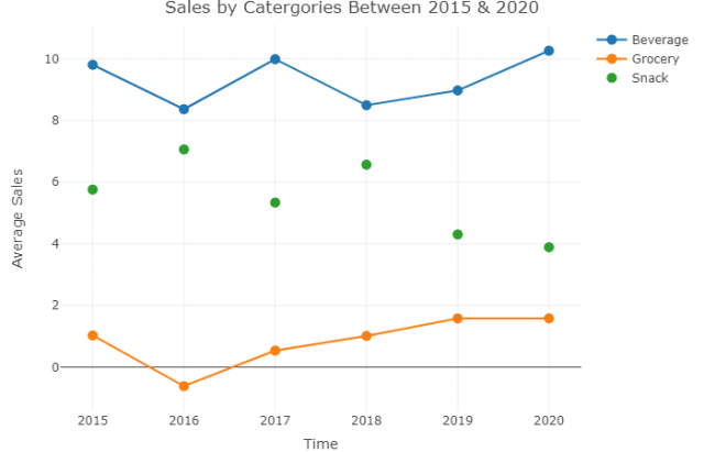
3. Plotting Markers and Lines
library(plotly)

# Data Preparation
#3 types of super market categories are listed below with average number of sales in a period.
x <- c(2015:2020)
Beverages <- rnorm(x, mean = 10)
Grocery <- rnorm(x, mean = 1)
Snack <- rnorm(x, mean = 5)
df <- data.frame(x, Beverages, Grocery, Snack)

# Data Visualization

fig <- plot_ly(data = df, x = ~x, marker=list(size=10))

fig <- fig %>% add_trace(y = ~Beverages, name = 'Beverage',mode = 'lines')

fig <- fig %>% add_trace(y = ~Grocery, name = 'Grocery', mode = 'lines+markers')

fig <- fig %>% add_trace(y = ~Snack, name = 'Snack', mode = 'markers')

fig <- fig %>% layout(title = 'Sales by Catergories Between 2015 & 2020',
                      yaxis = list(title = 'Average Sales'),
                      xaxis = list(title = 'Time') )
fig
add_trace= A scatter trace is initialized with add_trace. Here each trace named differently but specified as y= ~ because we want to see average values of traces on the yaxis. Then named x and y axis by writing yaxis = list(title = ‘Average Sales’), xaxis = list(title = ‘Time’) )
Conclusion
Hence, we saw the plotly package in R, how to install and load the plotly package in R, how to create interactive plots with plotly like scatter plot, lint plot and many more.
This brings the end of this Blog. We really appreciate your time.
Hope you liked it.
Do visit our page www.zigya.com/blog for more informative blogs on Data Science
Keep Reading! Cheers!
Zigya Academy
BEING RELEVANT